Timeline
6 Months
Tools
Figma, Protopie, Unreal, Jira
Team
Problem
Outcome
The Process
What We Learned from Users
Collaborated with product teams, analyzed interfaces from leading automakers using Screens Studio and gathered insights into most frequently used controls and frustrations by conducting surveys. Here are the main findings.
Overwhelming Menus
Users felt frustrated navigating through deep, complex menus to access essential features like traction control or seat adjustments.
Prioritization Gap
Drivers wanted fast access to frequently used controls, but these were often buried under less important settings.
Distraction Concerns
Users expressed concerns about the time and attention required to interact with the system, especially while driving.
Early Explorations & Flows
A collection of initial ideas, layouts and user-flows that I sketched using user insights and Ford OS design principles.

Iterative Decisions and Rationale
Left vs Right Aligned Access Panel
Driver Ergonomics
While driving, the left side of the screen is easier to reach, so we reserved that area for frequently accessed in-drive functions.
Context of Use
Access controls (e.g., opening trunk, charging port) are mostly used when parked. Placing them on the right side created a clear separation between in-drive and parked state functions.

Control Density & Layout
Too many controls created choice paralysis and interfered with cognitive ease and driver safety. We reduced density and moved to 2x4 layout after testing showed that users struggled to parse tightly-packed grids while driving
3x3 Layout
2x4 Layout
We also explored grouping features into subcategories, but avoided it unless the volume of features truly demanded it. Fewer controls didn’t justify extra layers, flat architecture served better for speed and recall.
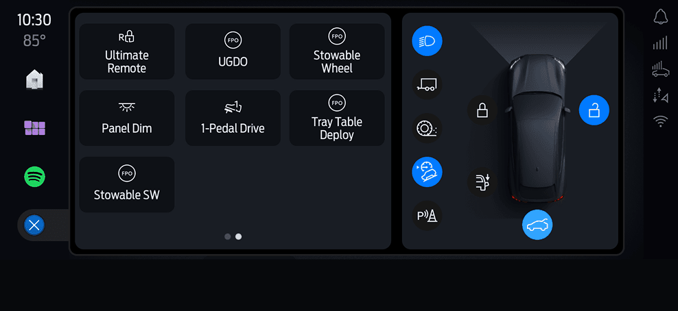
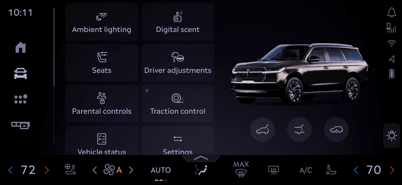
Vehicle Avatar Integration & Vehicle Feedback
Rather than a flat control list, some features used the 3D avatar to mirror real-world actions (e.g., open or close trunk, vehicle status). This was a systems-level interaction decision that improved learnability and discoverability over static UI.
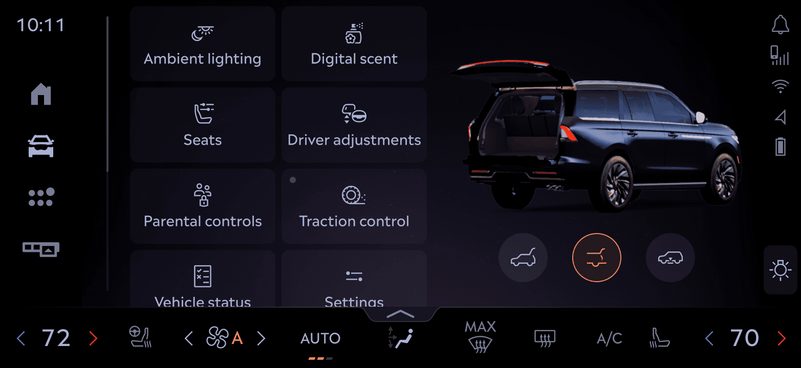
The avatar became a core part of the control experience, grounding the UI with a spatial, real-world reference point.
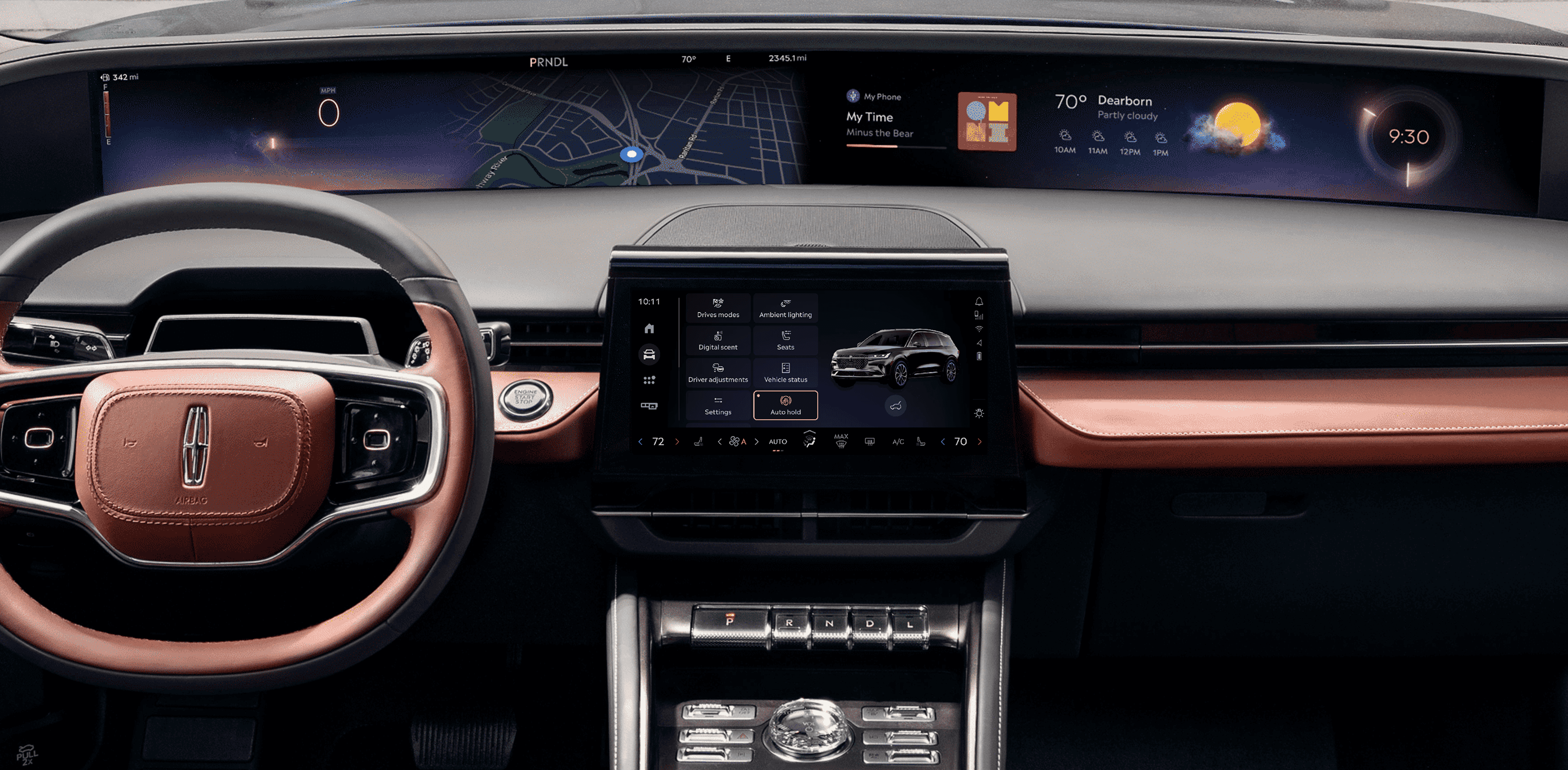
The Final Solution
We designed a flexible framework that adapts to driving context—minimizing distractions while still supporting rich vehicle interactions when needed. The focus was on clarity, safety, and spatial awareness,
System Architecture
Interface Breakdown
A sliced view of the final interface highlighting key functional zones—from access panel and vehicle avatar to control tiles, showing how each area supports different user intents with clarity and consistency.

Hands-On Interaction: Real-Time Control Flow
Captured on bench: showing how quick reordering and deeper control interactions work in real-time.
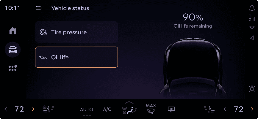
System in Action
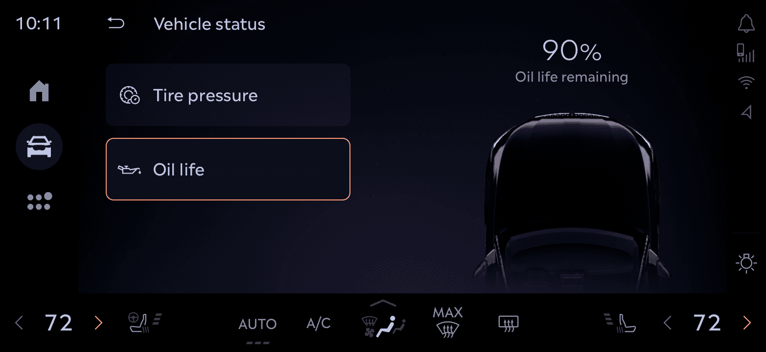
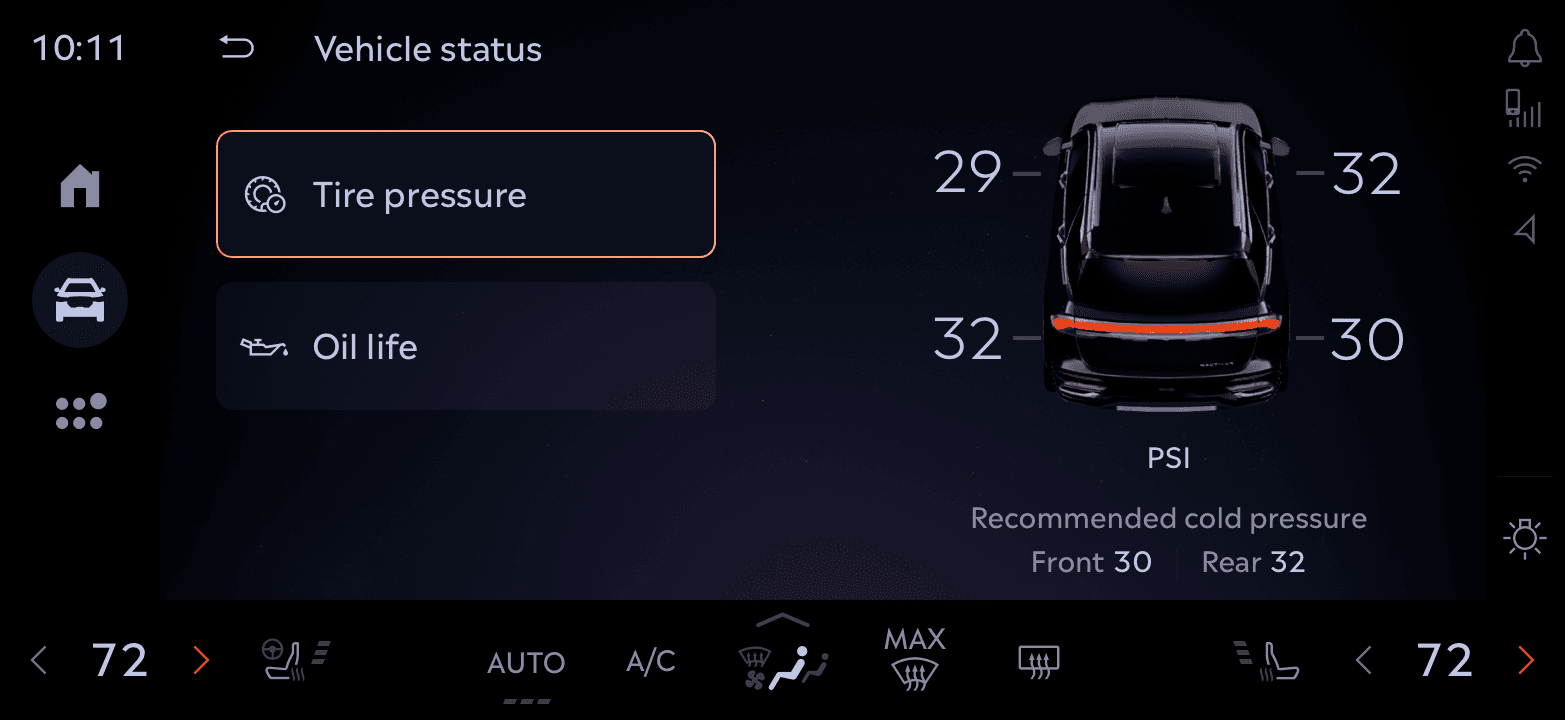
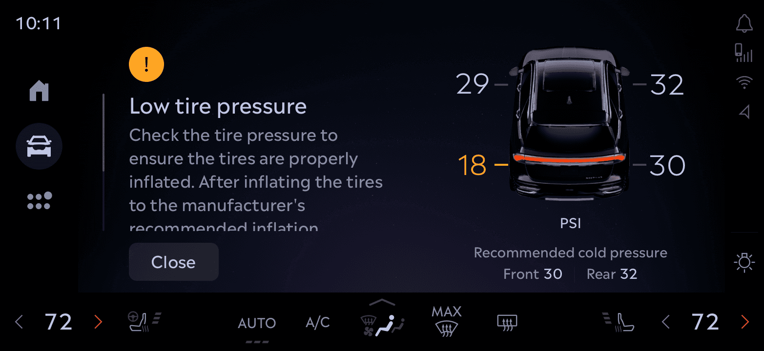
A look at how various control modules like Vehicle status, Parental Controls, Lighting, and more leverage this system. Some tap into the 3D avatar for immersive feedback, others remain lightweight for speed.


Impact & Adoption
Our design significantly improved usability and consistency across in-vehicle controls
90%
Task success rate when accessing key actions like trunk, drive modes, and lighting
30%
Reduction in time spent locating essential controls
15+ Features
Unified under a single, scalable interaction framework
4 Vehicles
Learnings
Practical takeaways that shaped the product and my design approach.
Identifying high-frequency and high-value tasks helped ensure that the interface delivered on the user's most immediate needs. This guided both layout and feature prominence.
Hierarchy reduces friction
Thoughtful grouping and layering of controls minimized cognitive load and made navigation more intuitive, even under motion constraints.
Iterative Design is Essential
Fast feedback loops with both users and engineers helped us uncover friction early. We tested hypotheses, discarded weak ideas, and doubled down on what worked.